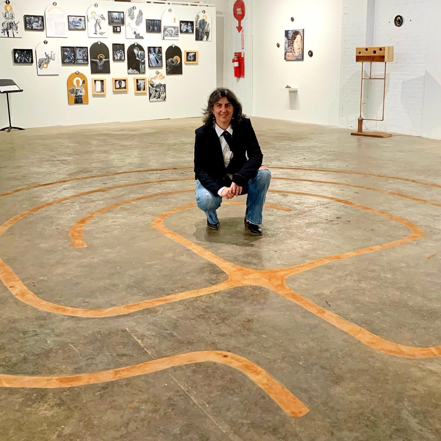
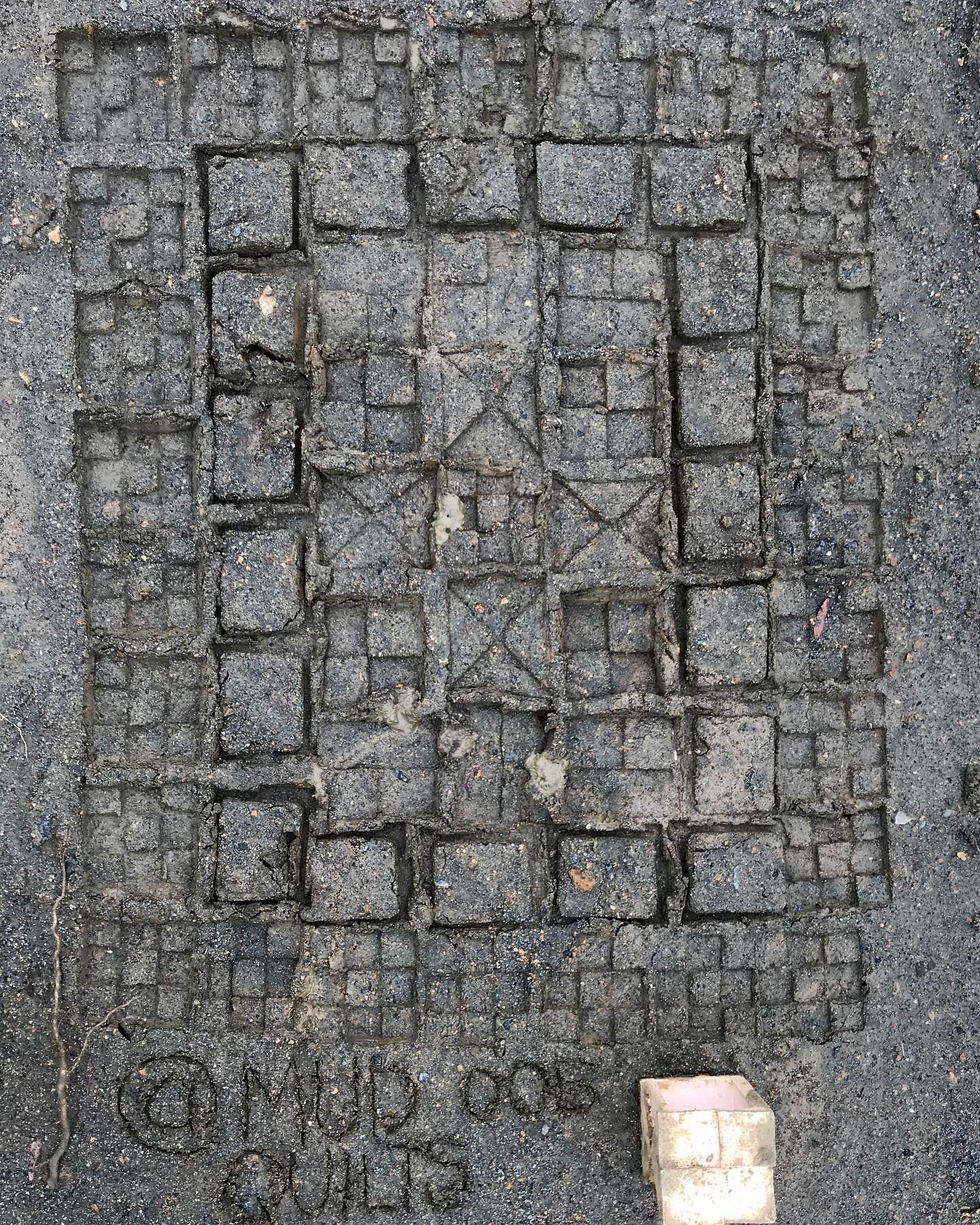
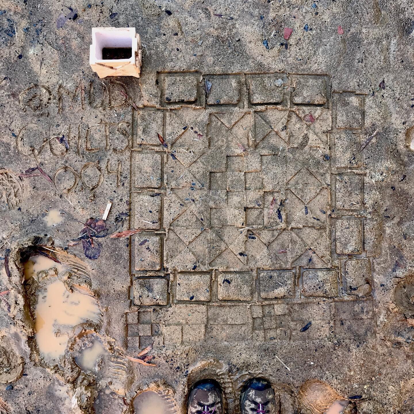
Tool Specificity and project success

Sometimes when tasked with what should be a simple job we find ourselves taking elaborate and convoluted detours as we must reroute our work to accommodate the lack of tools designed for very specific purposes. My simple bisque stamp for my Mud Quilt project is no exception. My prototype is a prototype not because I needed to work out how to approach the project but rather because I was not able to construct the piece to my liking with the tools that I had at hand.
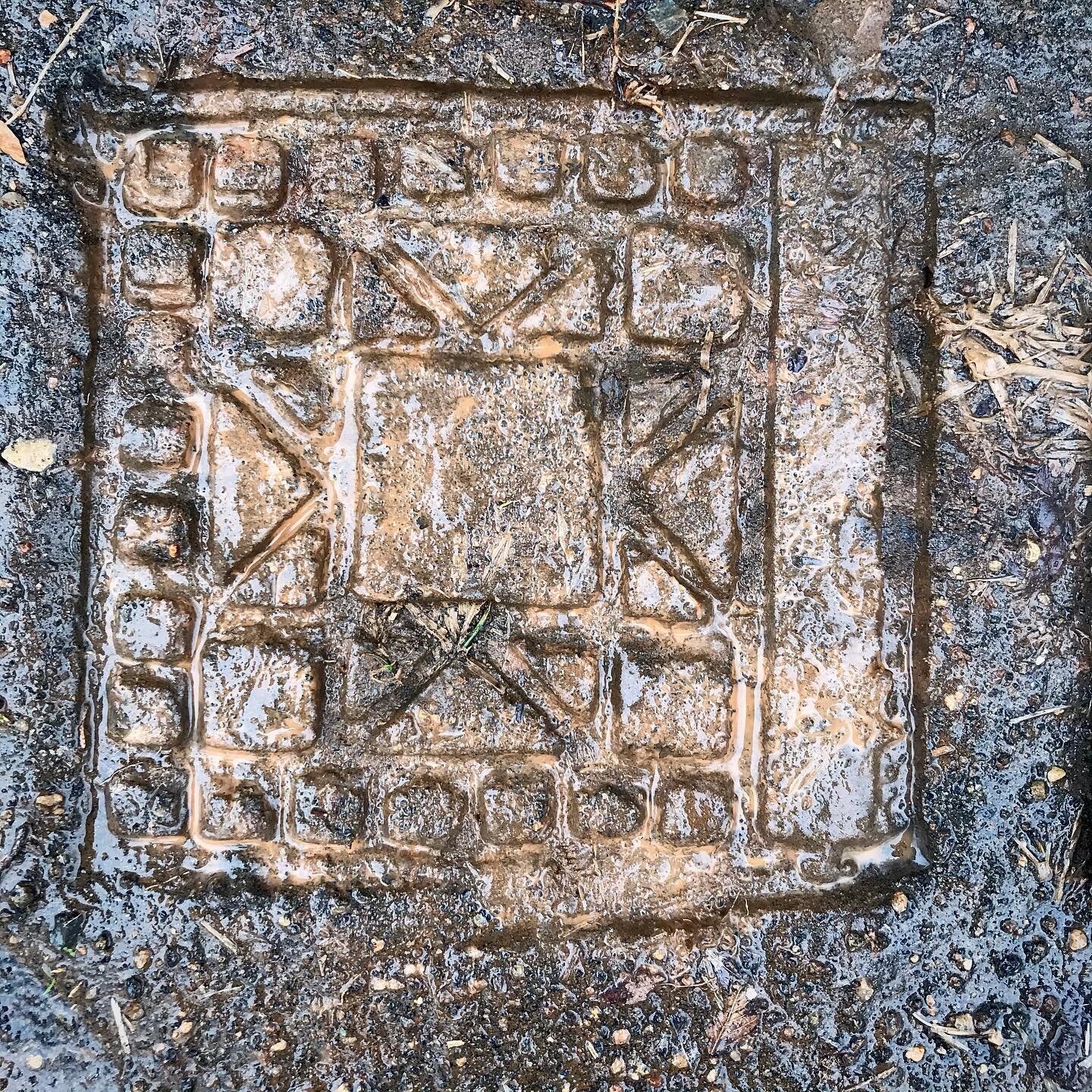
As you can see below I am making a cube with each of the six sides featuring a common arrangement of basic shapes that are used to form many quilt patterns. The tool that I needed was a slab cutter that could precisely cut 45° angles on my square slabs so that they fit together precisely and formed a strong edge that can withstand the pressure of being pressed into the mud.

I could have ordered the tool delaying my project, but fortunately we have a 3D printer and the skills to design simple objects like this one. An hour and a half after hitting print I was able to string up this simple little tool and cut perfectly beveled clay edges. It works so beautifully that I’ve printed several for each of the ceramic studios so that other student’s slab building can benefit from beautifully beveled edges.

Hand Painted Silkscreen Transparencies
This week I began my silkscreen printing journey. I am drawn to the mode of printmaking for my thesis because the form itself uses layers to express forms. The idea of layering fits nicely into my ideas about the generational patterns of land use. The patterns of our history are physically layered on the landscape.
I thought that when I began these pieces I would begin by working with the same photographs and digital textures that I am using to create the digital collages in my Faces and Places series. But at the urging of and with the encouragement of Maja to bring the work of my hand to these pieces I decided that I would attempt to make a print by painting directly on the transparency with an India ink.
I know that much of my work can tend to be too tight so I intentionally chose to work on top of an unfinished sketch as a reference and I tried to keep my brushwork loose and not try and make each color field match precisely. Below are two of the three transparencies that I have painted so far:

Today I was able to gain access to the print studio and burn my first screen and pull my first print. Below is the result on newsprint:

I have to reburn this screen because I did not leave enough room at the bottom to contain the ink from flooding and printing on the screen. That’s okay because I’ll remember to plan for this on all of my other screens. I had in my mind as I worked with this piece the Asian inspired prints of the Impressionists. I plan to go back and review the prints of Mary Cassatt - my linework is much heavier than hers.
As I planned the composition I was trying to create shapes/voids that would leave openings for me to play with textures and materials and explore that idea of layering. At home in the evening away from the studio I decided to scan these transparencies and create another digital collage using a similar process to my other pieces. You can see the result below and read more about this piece on my Faces and Places project page.
The one advantage of this digital process was that I was able to clean up a couple of smears of ink and also correct the brow line which I felt was much too heavy. Here is my first iteration of this composition:

Nomadland and the Visualization of Loss
I just finished watching the film Nomadland filmed under the direction of Chloe Zhao. (I want to watch her other films and read the book by Jessica Bruder.)
I watched the film a day after listening to a talk by photographer Daniel Kariko. Tthe germ of much of Kariko’s work seems to be an attempt to examine his own sense of loss and placelessness as he lives in a world in which his native country Yugoslavia no longer exists. He has recently begun a body of work documenting the life of the Balkan diaspora titled Days of Summer Past. There were so many echoes of his family and community’s experience in my own family’s and community’s experience in Appalachia. Those generational migration patterns and ‘being of two places’ is something that I want to explore more – I will need to face a rereading of Hannah Coulter at some point in order to begin that exploration.
But it was his project Speculation World through which he documented the Florida real estate crisis following the 2008 recession that came to my mind as I watched the film.
Kariko’s work encompasses same time period as Nomadland. Looking at his photographs of skeletal neighborhoods with empty lots gave my mind a visual and architectural context for the setting of Nomadland. The film portrays the loss of place through the life of the main character Fern (Frances McDormand) . The main triggering event of the film is the closing of the US Gypsum operation resulting in the disappearance of an entire zip code in Empire, Nevada. USG closed because there was a drastic reduction in the demand for sheetrock that is so nakedly documented in Kariko’s photographs:

Two for Two, Daniel Kariko, 2009
I have been thinking about how it has taken more than a decade for those events to make their way into our mainstream visual storytelling devices. We cannot fathom the full impact of loss without perspective. My viewing of Nomadland also serves as a reminder that we view everything through context. My viewing of this film would have been a completely different experience two days ago.
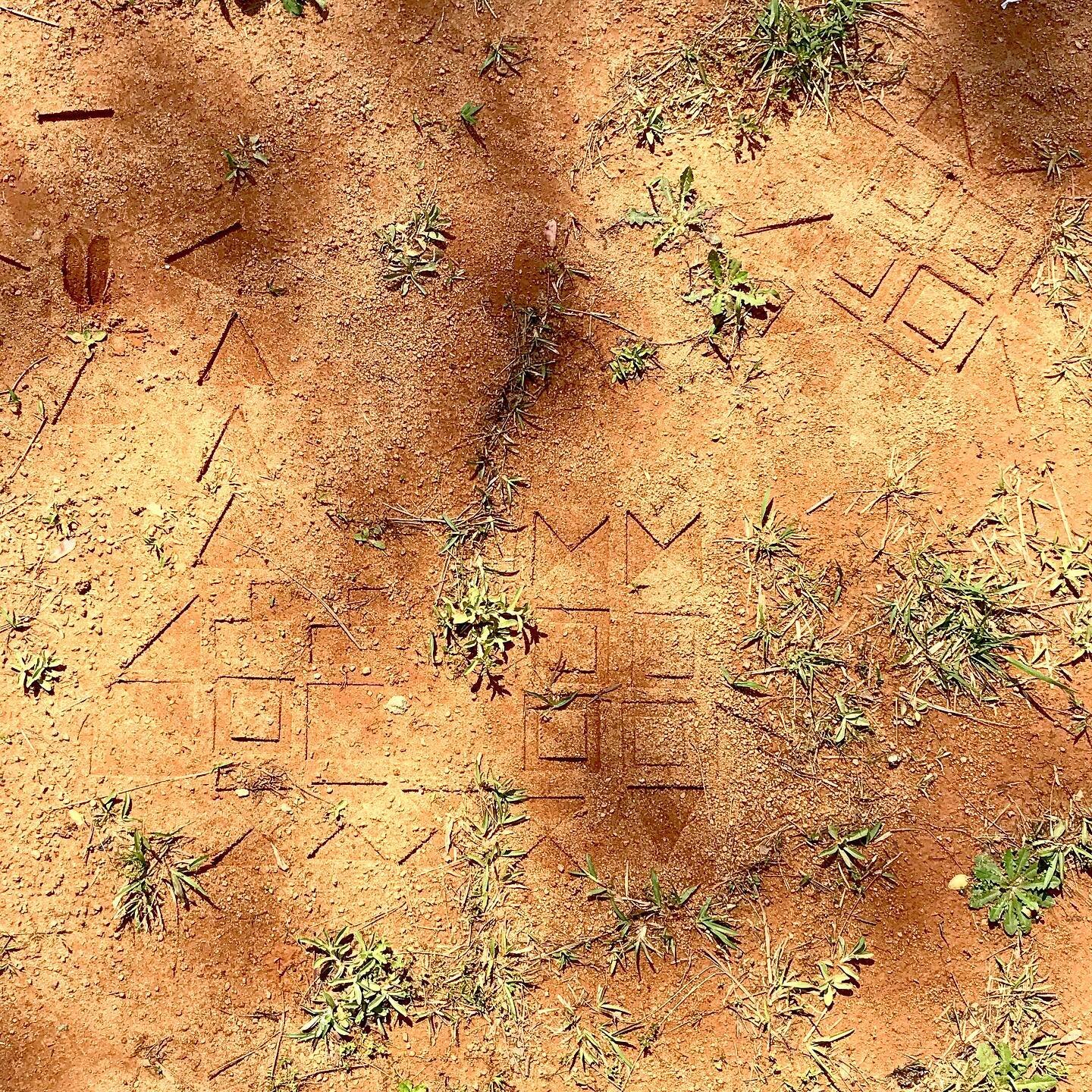
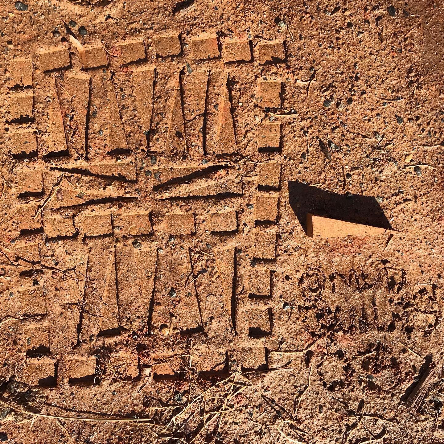
Reflections on Mud Quilts
This body of work that I have begun is little more than a sort of scratching or mark making in the dirt not unlike that work we did as children. This native clay accepts my thoughts and intentions, my rhythm, my pattern making, my timidity and holds their form as a memory for a while. These are not stable works as they are susceptible to traffic, construction, and the elements just to name a few vulnerabilities.
I was able to revisit Impression 003 three days after it was made to document changes in the piece. The clay at the site had a drastic change in color becoming lighter as it dried. The shapes made by the compression of my stamp retained more moisture and were darker in appearance giving the piece a heightened contrast. My lettering which was hardly discernable at all when I created it could be clearly read.

You can see in the cracked and drying clay around the quilt that my work brought stability to the earth at this construction site. The piece survived for many days; even after several rains it was still partially visible.
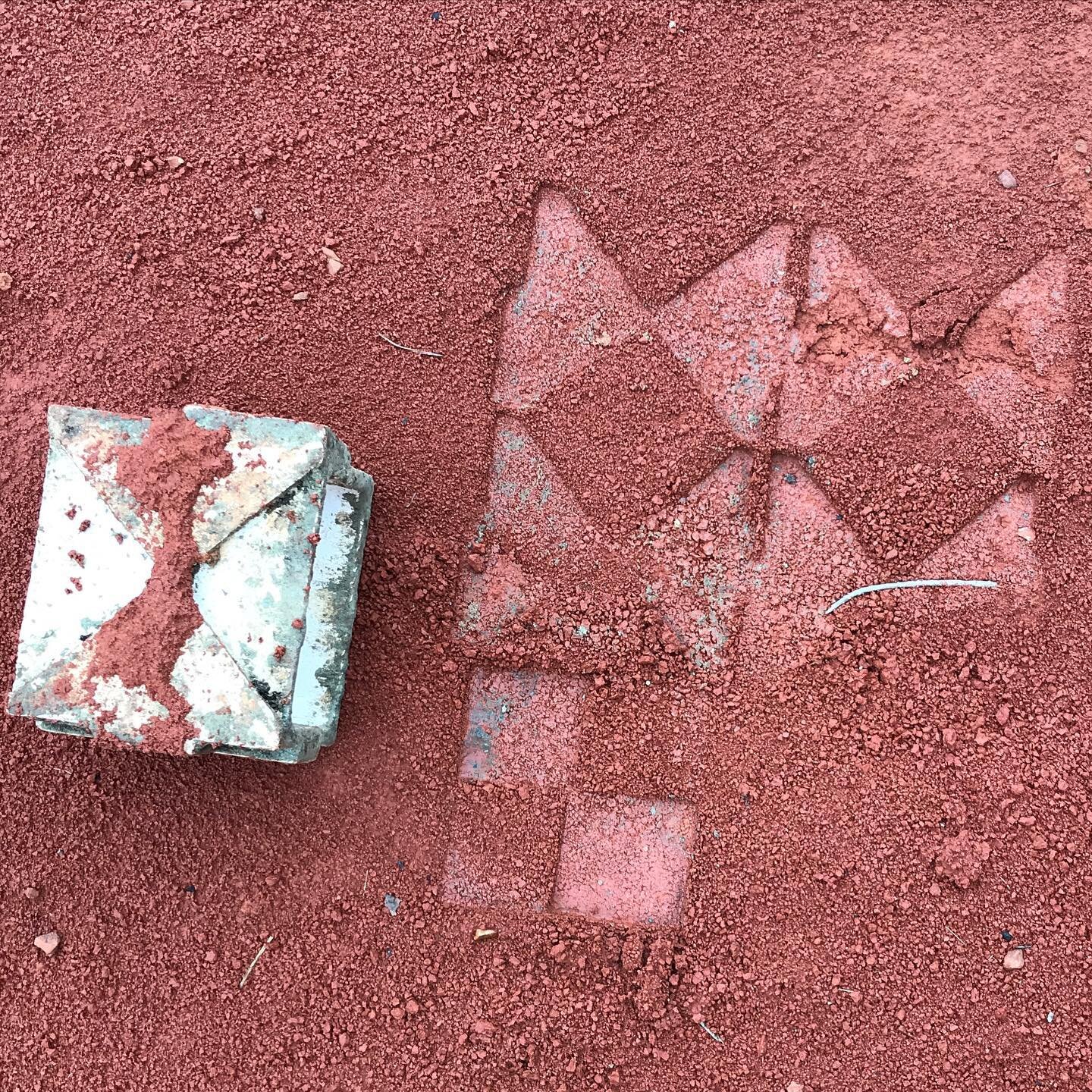
Since this impression I have been working on a bisque stamp with which I hope to make larger and more quilt-like impressions. The prototype is in the kiln as I write. Below you can see a couple of photographs of the stamp in progress:


Thinking About Layers
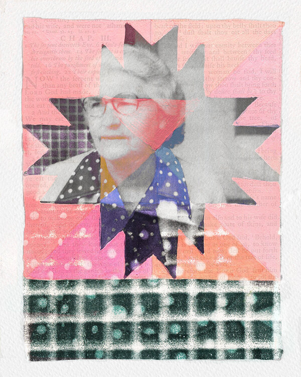
I think that I have finished Goin’ Visitin’ (you can read the accompanying description on the projects page). I’m really trying to push my Ps skills in these pieces. I’m also trying to fully explore this idea of a geobiography. How can you represent it visually?

I pulled into this portrait many references that anyone who knew Virgie well as well as faint references to the Stecoah Township in the 1980s. Stecoah has always had such a strong community identity. I’ve been thinking about why that might have been and how I might express those in words. But it has something to do with layers. Stories and memories layered overtop of landmarks, trails and fields. Walking the same worn path from the back porch to the garden or down to the spring that had been used for years. Life was lived in layers.
Virgie was one of the brighter personalities and was known far and wide - you can see it in her expression, right?
You might also be able to tell if you look closely that I landed on included the book of Ruth as the text layer in this piece. I chose this portion because Virgie left home at the age of fifteen to marry a much older man. There were just echoes there that I wanted to capture.
Compositionally there were some challenges in the way the images were divided. The quilt square creates such a distinct line. Initially I brought in the grid of the screen porch scaled up to fill in that space and then a layer of the polka dotted shirt large over top of that. The blend layers created some interesting coloring choices in her shirt that I liked and decided to keep but they were isolated in the center of the canvas. I attempted to bring in those colors in the grid section to tie the two sections of the piece together and move the eye around a bit. I think it works - I’ll know better when I return to look at it again in a few days.
Amos Kennedy - Proceed and Be Bold

"Amos Kennedy Jr." by Virginia Humanities is licensed under CC BY-NC-ND 2.0
This week’s book arts resources included a video about letter press printmaker Amos Kennedy - Proceed and Be Bold! Amos is an interesting character. The documentary talks a bit about the rise in letter press work in general - Hatch out of Nashville has a cameo appearance. Hatch is on my places to visit.
I really enjoyed Amos’s sense of humor and frankness. His Nappy Gram project was awesome - as was his response to being questioned by the police department regarding one of his affirmative action post cards. There is a section of the film that addresses him calling himself ‘negro’ that is very informative and challenging. I respect how he confronts things head on and uses racially charged icons and stereotypes. It seems as if he’s saying our problems aren’t going to go away if we just clean up our language and iconography and ‘make nice’.
The most interesting part of the film for me was when Amos was discussing the passing away of the southern rural African American way of life. It is a rich culture that we don’t seem to pay very much attention to.
Below is the link to Proceed and Be Bold! I highly recommend it.

ARTF 3351 Book Arts
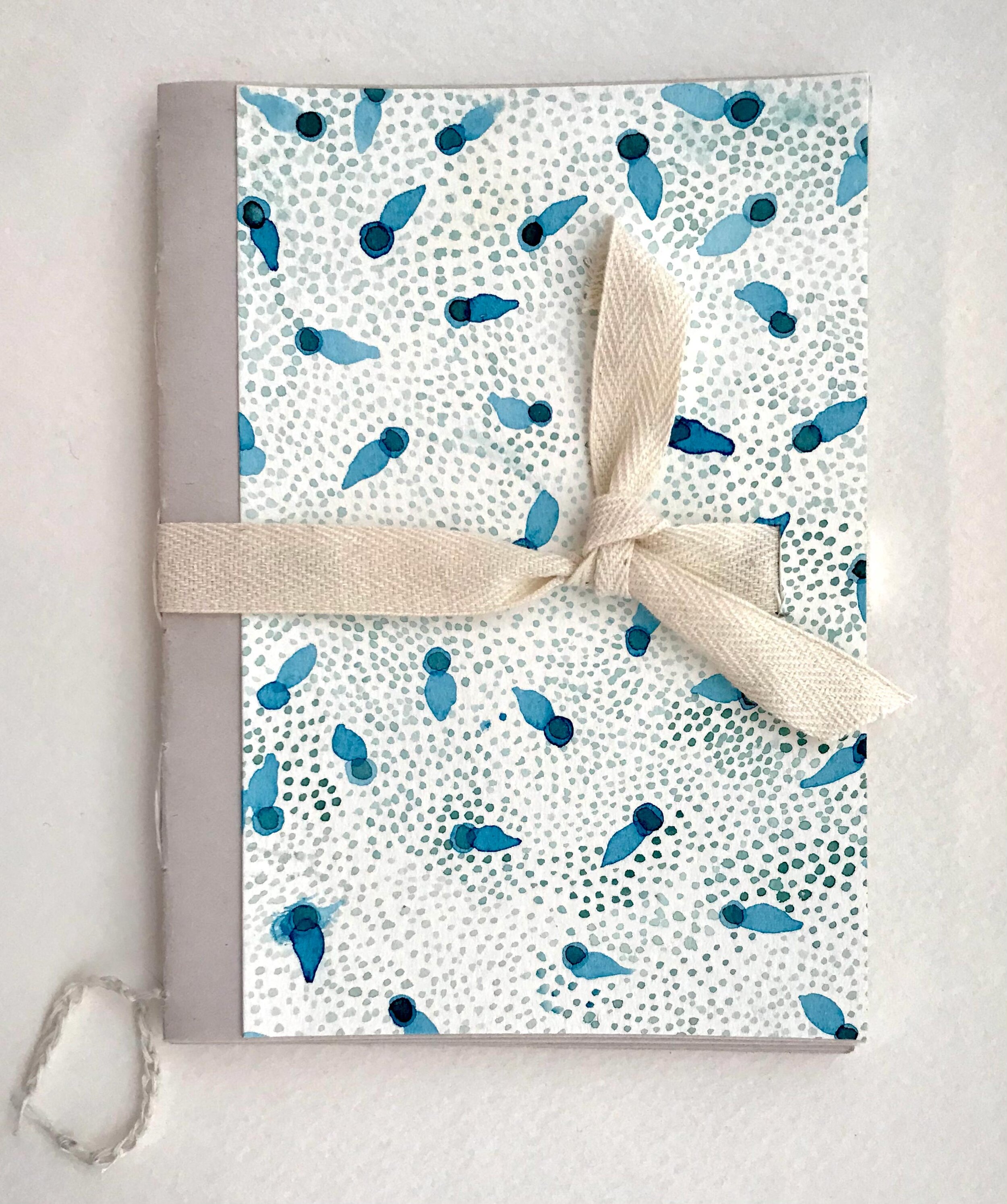
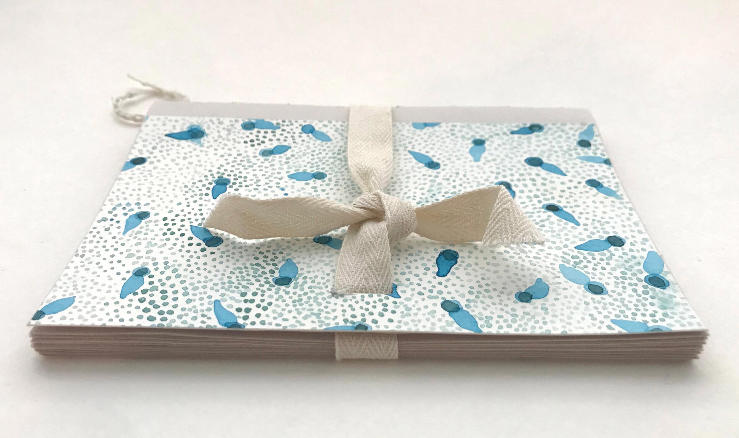
This semester I am enrolled in a book arts and mixed media course. We just completed our first assignment which was to design and bind a sketchbook to be used in our coursework.

Before sewing together my final project I practiced the French link and kettle stitches on this little watercolor dummy. The cover is a hand painted scrap left over from a fabric design project. I found this YouTube video demonstration of the stitches very helpful: French Link Stitch by Sea Lemon.
My professor’s advice, “Don’t be a dummy, make a dummy” proved to be very good advice!
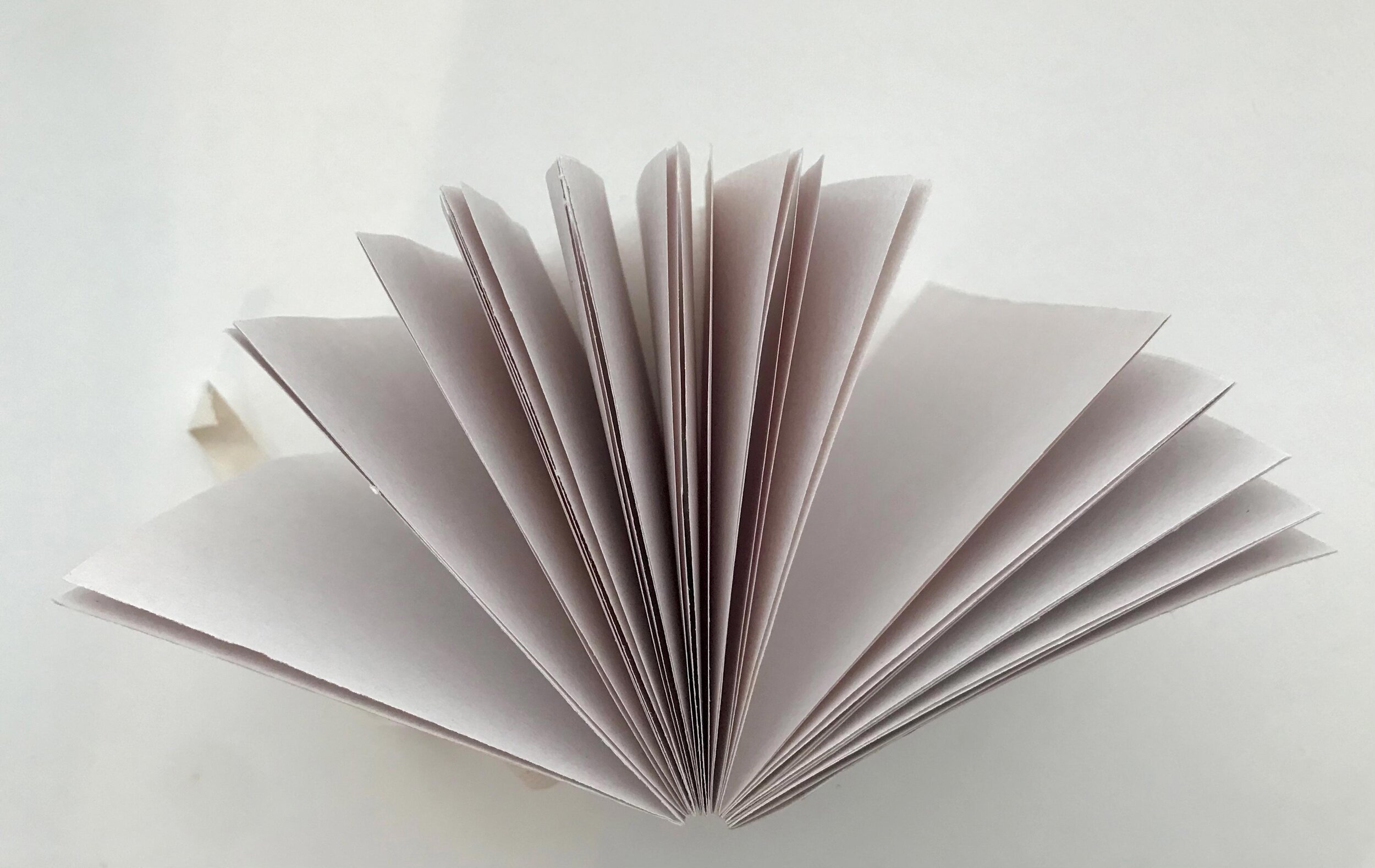
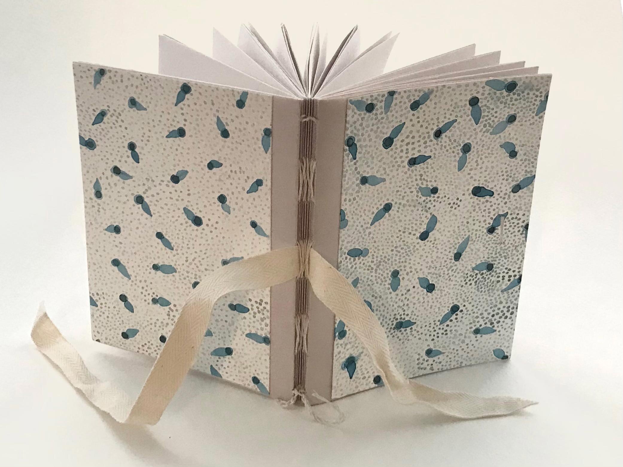
Below are the final photos of my sketchbook project. and I am well pleased with everything except the looseness of the pages. I am considering using a thin layer of PVA or hide glue on the spine to bring a bit of firmness to the spine area.
Possible ways to improve the sturdiness next time:
A sturdier form/clamping system when sewing
A thinner needle
Perhaps thinner thread
Stronger paper which might withstand firmer stitching
Changing the cover design to strengthen the binding
Try a new stitching pattern
I decided to organize my sketchbook around the class assignments creating a signature for each assignment and the proposed paper explorations. I chose a variety of simple papers of varying shades of neutrals (nothing precious). For interest I chose not to make all of the papers the same dimensions. This along with transparency creates a layered interest inside the book:

The outer newspaper strip serves as a title/banner for over a transparent marker paper that lets you peek into the project interior. The lined paper is from a disassembled vintage spiral notebook. I chose to flip the holes to the right for a bit of surprise and to form a visible border. The lined page will provide a place for the project summary. The newsprint is perfect for sketches while the nicer white drawing paper will feature the final project. The later half will provide a place for a reflection and a place to note inspiration/references:

I created a special signature at the front and back of the book to feature a bright color on the spine and to add a cover/fly sheet and create room for a Table of Contents. You can see that I also inserted a cut out from a set of blueprints for a vintage shed that I found squirreled away at my in-laws:

I chose to make my book boards narrower than the text block to feature the bright interior paper. The boards are covered with the envelope that the blueprints were contained in. The backside of the envelope had a rust stain from being stacked on something. I thought it would make a great frame for a title or label and you can see from the first photo at the beginning of this post that I took full advantage of that.

Be Frank
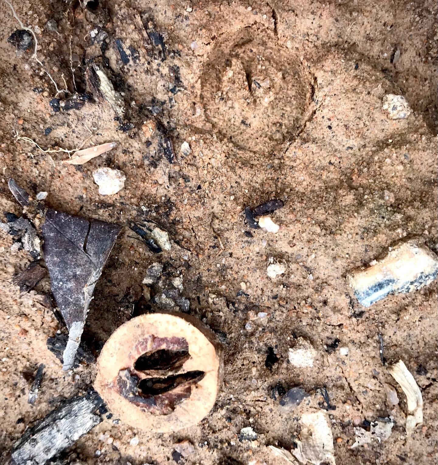
Today I visited Frank Liske Park after most of this weekends rains had subsided. I wanted to experiment with pressing designs into the ground. I took my quilt inspired watercolor palette from this summer’s Topics In Ceramics class and also some rubber letter stamps. I also played around with stamping with found rocks and sweetgum balls.
The sweetgum balls were too soft from the rain and gave way before making too much of an impression. The rocks did okay and with persistence perhaps you could find a rock with clearly defined edges that might work quite well. One thing that I noticed with the rocks is that it created a resistance/suction with the earth and sometimes a clump would stick to the rock and come away ruining the pattern. The rubber stamps did okay on some surfaces but are really too shallow to make much of an indention in the coarser grands of the surfaces I could find.
I thought that sandy breaks along the creek bank might work well but they turned out to be a bit to coarse and granular to capture good details. In the end I good a good impression in a muddy road exiting a picnic area – this is the Impression that I chose to document:

I experimented documenting an Impression with my GoPro and also documented other things from the site– some videos of the storm water flowing over the rocks and waterfalls, some beautiful fungi and a bright chartreuse lichen. You can take a look at everything on Google Drive.
Goin' Visitn'
Here is this weekend’s progress on my next portrait:
The Bible page texture is a place holder from the internet until I can get a good scan of my own. I’m considering which book and chapter.
This is Virgie Crisp of Dry Creek which is located within the Stecoah Township. Virgie was known for being able to spit further than any man I ever knew and though her hair was silver turned a cartwheel at the drop of a hat.
Sundays growing up were often reserved for visitin’. After church services and dinner were over the older generation (many who were shut ins) would open their doors or sit out on the porch or even drag a bunch of chairs under the shade tree. The younger generation with children and the ramblers would drive up and down the creeks to visit. Sometimes you would pull up and hang yourself out of the truck window and jaw and sometimes you would get out and sit awhile and occasionally you were invited to stay for supper. We visited Virgie and her husband Bart many Sundays.
I’m not sure if this piece is finished or not - it seems that maybe there is room for something else thought I’m not sure what at the moment.
Support My Projects
If you like what you read and see here and are interested in supporting my work feel free to click the button below.
mud quilts project


Personal Instagram